
The Augmented Reality Makeup Experience
Conceptual Design

ON.ME is a market place for makeup companies that would like to participate in non store customer experience and sales.

ON.ME is a market place for makeup companies that would like to participate in non store customer experience and sales.
Team mates included: Niqua Charis, Patrycja, Katy
Duration of the project: 2 Weeks
My Role: Research, Usability Testing, Contextual interviews, Design Studio Sketching, Persona Creation, Screen Creation
Scope of Work
The scope of the work is gathering information on what drives users to try on makeup, how they use the makeup they purchase, when they use the makeup they purchase, and how they test the makeup. The goal is to solve any pain points with our application.


RESEARCH PHASE
Heuristic Analysis
Allows us to use Abbys Methods to compare our competitors sight as well as compare our own to these standards.
Contextual Interview
During the Contextual Interviews, we followed 3 women around the beauty and makeup store NYX in Union Square to observe them trying on and purchasing makeup products.
User Interviews
We promptly created a User Screener to find potential interviewees that purchased makeup and wear it regularly. We recruited 4 women and 1 man to ask them about their purchasing habits and regular makeup routine. User Interviews exposed some key points!
Takeaways
One of the major insights that we gained through interviews was that many people receive their inspiration to purchase makeup through instagram and youtube. because of this insight, we considered incorporating a feature into our app to accommodate that finding.
My Role: In this phase, I participated in Contextual Interviews. Gathering behaviors and habits of the users while they shopped in stores like Sephora and NYX help us in the next phase.
I also conducted User Interviews which included discovering which brands of makeup consumers used, where they go to shop for makeup, and their experience inside of stores, and even returning merchandise was noted.
Synthesis
Taking from our Contextual Inquiries and User Interviews we took all the insights and quotes and recognized the common themes. The common themes we then turned into statements that captured the general feelings of our users.
Love points:
I like to try before I buy
I like makeup to be easy
and convenient
I like to look for new tricks online
I match my makeup to the occasion
I like buying in store
I like to enhance my
Natural beauty
FINDINGS FROM OUR USERS
Pain points:
• I want to feel safe when trying on makeup
• I like makeup to be easy and convenient Revised Problem Statement
Too Faced offers a plethora of makeup products for women to browse and try-on. However, the makeup testing process is tedious and time consuming, all while the spread of contamination via testing makeup is a concern for many.
How might we provide a relaxing and safe experience in makeup testing?
Personas
After evaluating the pain points, user goals, and contextual interviews; we created 2 personas Ana Camille and Zeed Rafael.


My Role: In the Design Phase, I created low and mid-fidelity wireframes. These wireframes were linked together using InVision for initial prototyping and Omnigraffle for micro-interactions.

Mid and Hi Fidelity Wireframes
DESIGN PHASE
Design Studio: Sketching + Concepting
During Design Studio, my teammates and I translated our users and personas pain points into actual features to be designed to and for.
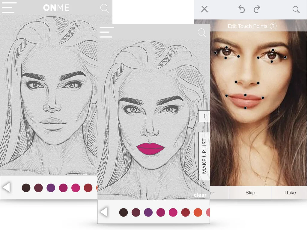
The need for a hygenic experience has already been addressed through augemented reality verses trying makeup on with testers.
Also, the need to feel inspired was addressed by making youtube inspiration videos of influencers wearing Too Faced Makeup brand, available for users to access through the app.
Wireframes
My team and I sketched out wireframe of how we thought the layout should look and in the end married our design into one.


User Testing Results
After a few rounds of testing, the screens were tweaked to change some aspects as per the request of users. We re-worded the menu, and changing the lip icons.
Findings
Users enjoyed having the new options available to select from in the menus screen.